Launching FX trading apps in a new market
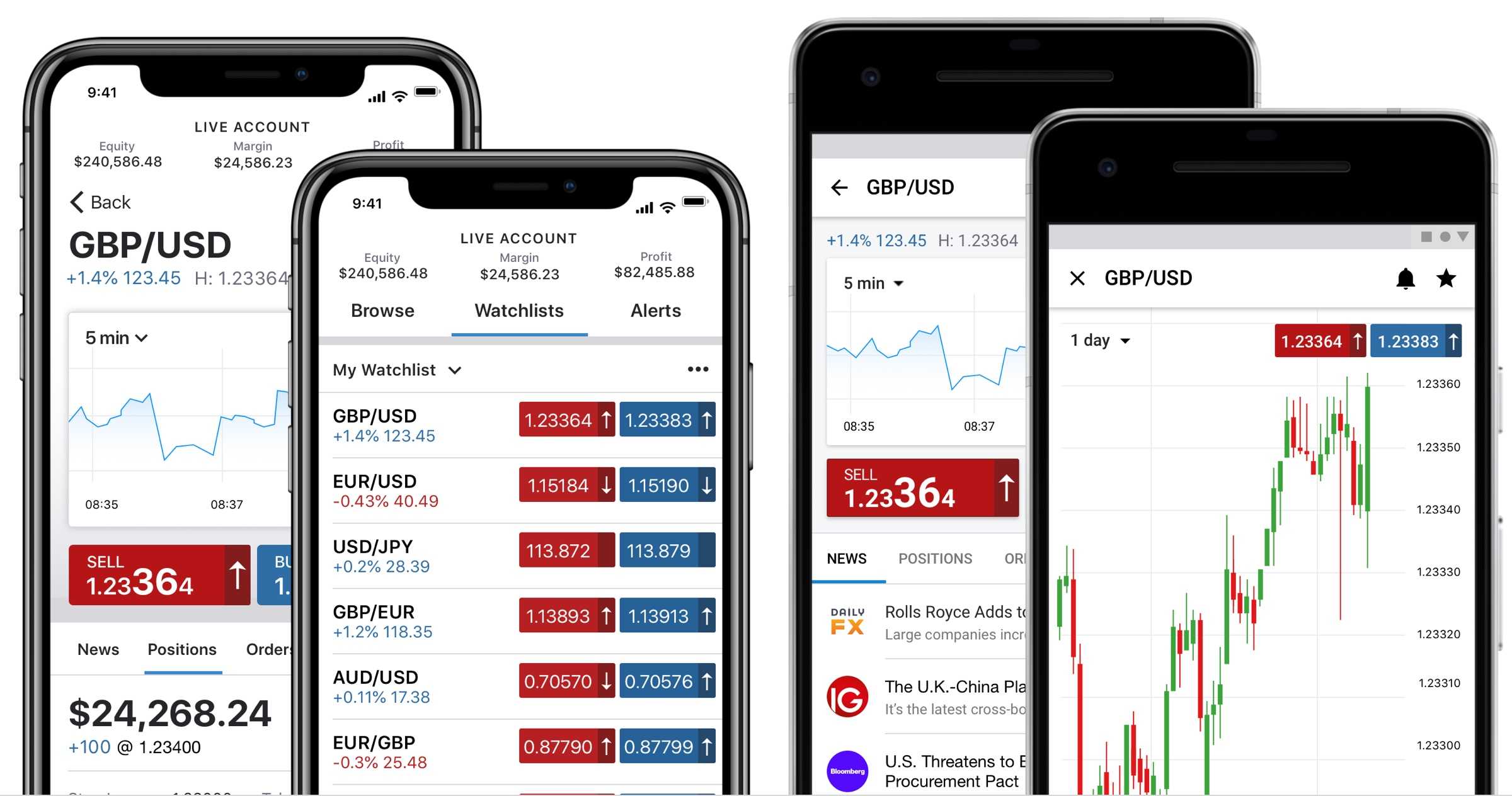
Launching a new product is always exciting. Sometimes it can provide unique design opportunities too. IG's application to offer regulated FX products to US clients gave my team the chance to implement our design vision and build two world-class trading apps.
Challenge
The US FX industry has some of the most stringent regulatory conditions in the world. Adding to the technical and cultural complications of exporting a primarily European product, the challenges of launching in the US soon added up.
As the lead UI designer for the mobile platforms, I was accountable for the design of IG’s new US-focused iOS and Android apps.
Our first task was to establish the differences in terminology and regulatory requirements between our existing and proposed apps. Working with the wider mobile teams we compiled a specification for the new apps.
The next step was creating a series of prototypes to test our assumptions. Due to the complexity of the trading regulations we needed a way to simulate the expected outcomes. The solution was to use Framer to adapt IG’s trading APIs so we could create a realistic example for clients to test. This was a huge undertaking and a technical first for IG.
Once we had a set of prototypes to test, I worked with the UX research team to facilitate a series of user testing sessions in Chicago. They focused on validating our early assumptions and involved both experienced and new to category traders.
Existing designs
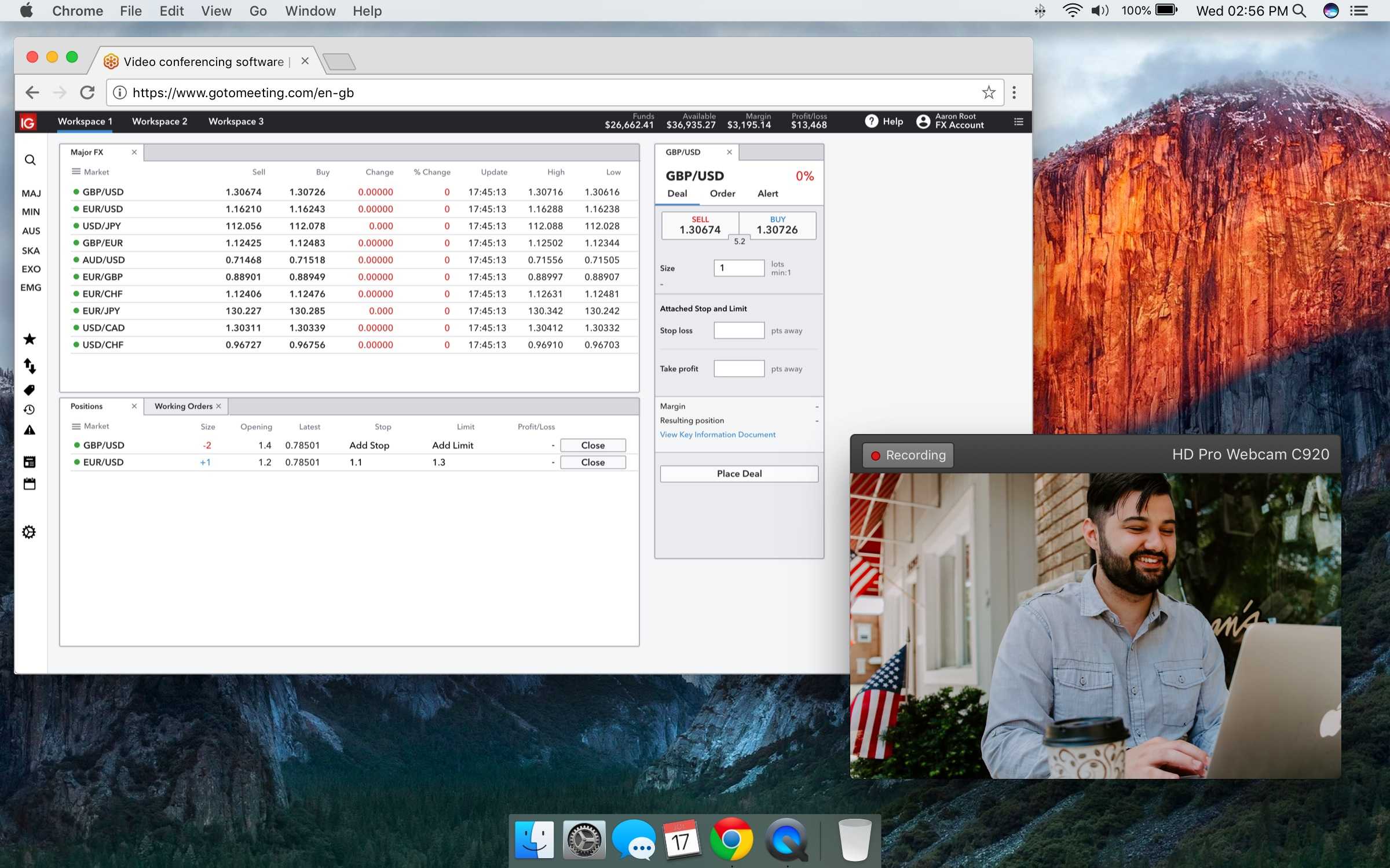
Although the early prototypes were based on the existing trading platforms, there was a strong desire from the product teams to move beyond what had been achieved before and create something truly innovative.
iOS App
The existing iOS app designs were dated. They lacked hierarchy, structure and conformed to an older navigation architecture.
Based in the London office, the iOS development team wanted to start with a completely new code base. As a result of the recent 'Swift Nights' the team felt confident that they could rewrite the app from the ground up.
This meant the design team could focus on producing new work based on the recommendations of the mobile vision project.

Android App
The Android app suffered from many of the same design problems as iOS. Additionally, the progress made with Material Design was absent from the IG app..
Based in the Krakow office, the Android development team wanted to clone the existing trading app, concentrating instead on refactoring the code to separate the UI and business logic elements.
Although the outcome of the two apps would be the same, due to the difference in development strategy the design team needed to support the iOS and Android teams in different ways.

Native first
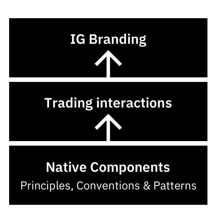
Native apps should feel like part of your device, using default fonts, components and transitions where possible. This avoids redesigning common patterns such as toggles or list and allows designers to focus on trading-specific elements. Here time can be spent perfecting interactions and creating an experience that feels unique.
Iterating the mobile vision
The team had recently finished putting together a long-term vision for mobile. The new FX apps were the first chance to implement that vision in a comprehensive way.
The project made seven recommendations that aimed to streamline key trading tasks and align the visual identity, functionality and common interaction of IG's mobile apps.
Smart onboarding – Explore and personalise straight away
Trade everywhere – Streamline the deal flow
Market centric analysis – Bring together analysis and exposure per market
Consolidate trading activity – Trading Activity in one place
Discover new opportunities – Awareness of other interesting markets
Manage accounts – Visual account health and inline funding
Increase engagement – Reduce friction and increase visibility of IG
Formation Design System
As well as the mobile vision, we had been working on adding mobile patterns to the design system. Formation was created to unify IG's platforms, create a shared understanding of design principles and enable teams to work more efficiently. Again, the new FX apps were a chance to put this to the test.
Find out more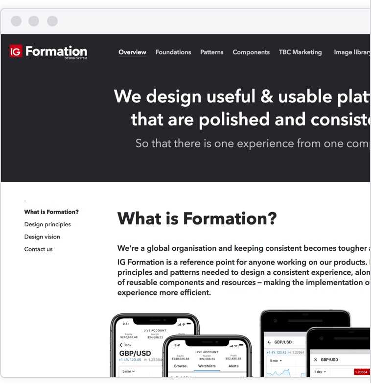
Market screens
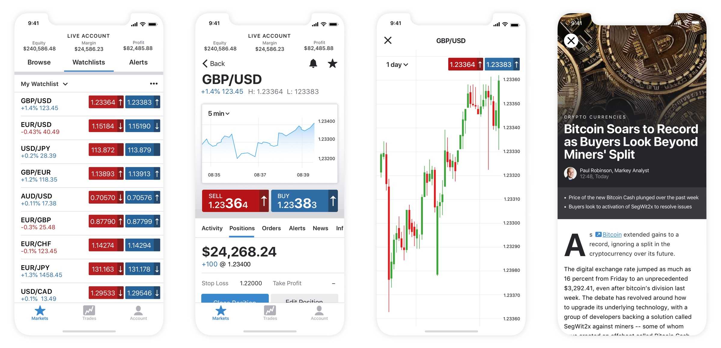
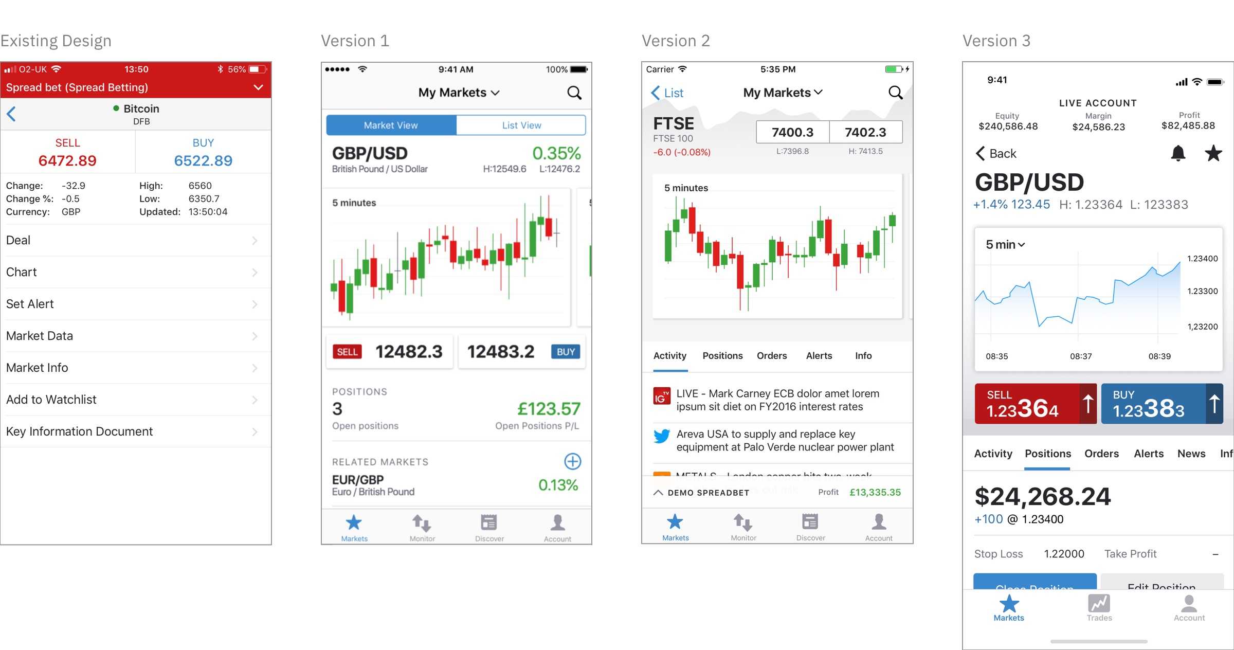
One of the key changes we made as part of the redesign was a move to a more market-centric app structure. Rather than browsing by feature, e.g. news or positions, we presented all of the necessary market information on a single page.
Arriving at a final design took time. Balancing the need for data density with a clear hierarchy was challenging. We achieved the final design after a number of iterations, testing different versions with clients along the way.
Minimum Viable Product
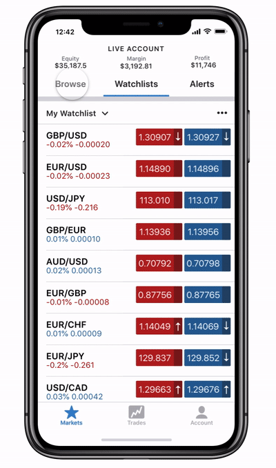
One of the biggest challenges we faced as a design team was supporting the different development road maps of the iOS and Android teams. As mentioned, the teams took different approaches to the app’s development, which had a knock-on effect on feature delivery.
The best way to address this was to create an MVP prototype for each platform. This allowed both teams to see the end goal, and work with the designers to adapt it to their development stories.
Outcome & Learnings
After months of hard work, we finally had something that we could take to market. The final apps were a product of the mobile vision and design system that proceeded them and were the best example of IG's aspiration to build category-defining apps.
