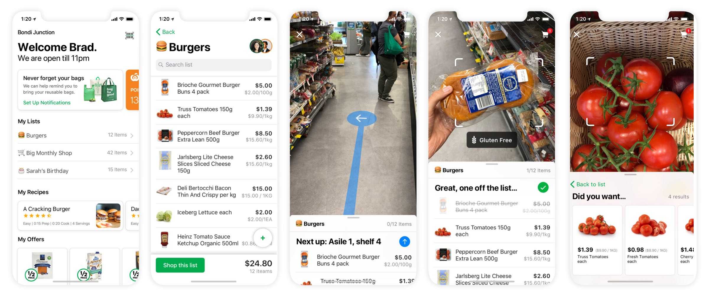
Augmenting the in-store shopping experience
Continuous improvement initiatives are a great way to iterate and enhance existing features. Occasionally, they present an opportunity to initiate more fundamental change. The scanner project helped me turn a neglected feature into a catalyst for redefining the in-store experience.
Challenge
After joining the mobile team in October 2018, my first assignment was to redesign the app's barcode scanner. The team had begun collecting data on the existing implementation and the initial research pointed towards a few areas with room for improvement.
The areas of focus were:
- Improving the scanner UI
- Giving better user feedback
- Providing more accurate product results
Discover & define
After reviewing the team's research, the next task was to explore and define the problem further. Part of that process was a heuristic review. The review highlighted key pain points but also indicated opportunities for improvement.
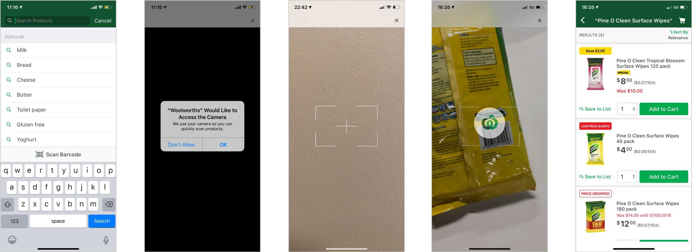
Existing designs
Heuristic review
Flexibility and efficiency of use
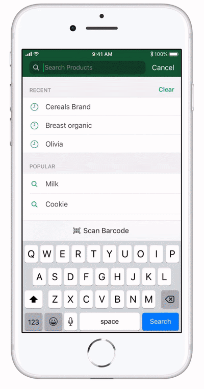
One of the primary user tasks was to add items to your cart ready for checkout. Another was to add items to a shopping list to purchase at a later date. The former was fairly well supported with a link from the product search page. The former was fairly well-supported with a link from the product search page, but there was no access to the scanner from the list section.
Another common user task was to scan multiple products consecutively. This behaviour was also overlooked. After each scan a user had to return to the search page and navigate to the scanner again.
Match between system and the real world
When a user launched the scanner for the first time the OS requires a user's permission to access the camera. In the existing implementation, the alert was presented immediately with little context around how and why the camera is needed.
Visibility of system status
A serious failing of the scanner was the lack of feedback. If an unlisted product was scanned nothing happened. If a listed product was scanned, the only feedback was a loading screen.
Help users recognise, diagnose, and recover from errors
If a product was successfully scanned the user is eventually presented with the results for that exact product. Due to the design of the product pages, if that product wasn't in stock, no alternative (sizes, flavour, brand etc) were offered.
Help and documentation
There are a number of issues that can prevent a barcode from being recognised. These include poor lighting, lack of focus or obscured barcodes. The current implementation had no way of giving timely, helpful information to the user in order to avoid these issues.
Consistency and standards
The grocery app had recently been redesigned but the scanner was still using older styles. The navigation header was now inconsistent and the close button was in the wrong place.
Aesthetic and minimalist design
The interface for the current scanner was minimal, but basic. How could we overlay additional information for the user? Is there any value in framing the barcode better? Could more be done to shape the view to the scale and size of a barcode?
Best-in-class apps
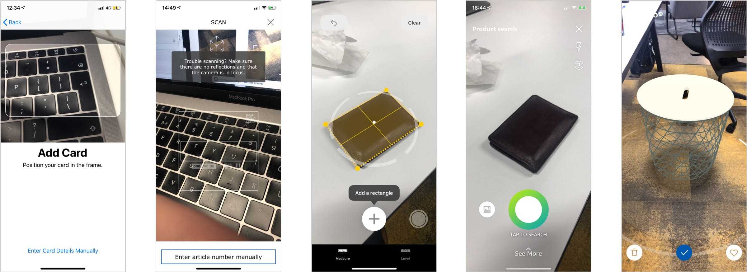
Once we had a better understanding of the failings of our scanner, I started to review how other applications use a camera to aide customers. Although the use cases were quite different, there were a number of similarities in approach.
Framing the problem
The last stage of the discovery process was reframing the problem. I'd started with a fairly narrow scope but after further exploration had found a number of other opportunities that could be worth investigating. I presented my findings to the app team for feedback and with their help, validated, defined and prioritised the problems.
Ideate & prototype
Sketching sessions
I think it's useful to work through a number of concepts quickly when starting a new project. Sometimes that's with the team, other times that's on my own with a scrap of paper in front of sketch.
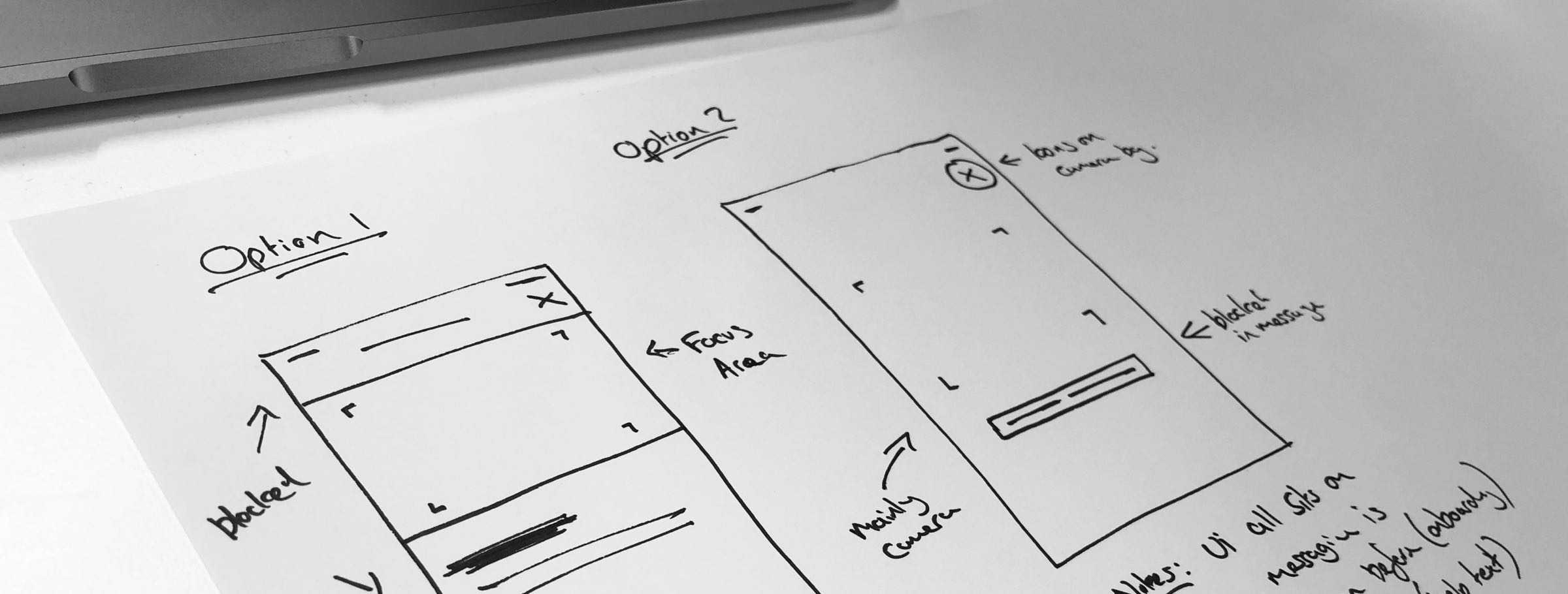
An issue that concerned me from the best-in-class analysis was how much of the screen to obscure. The sketch below is some early considerations.
Concepts
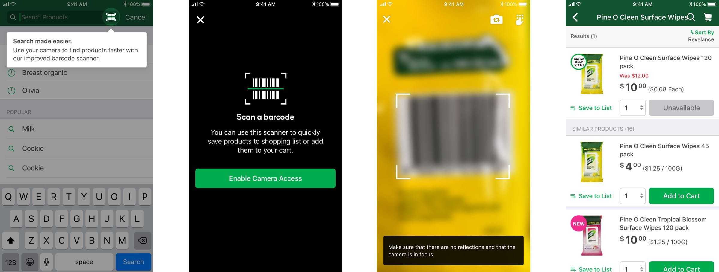
Because the heuristic review highlighted a number of opportunities, I wanted to visualise some potential solutions in order for the team to evaluate and estimate the technical work involved before we defined the MVP.
Sweating the details
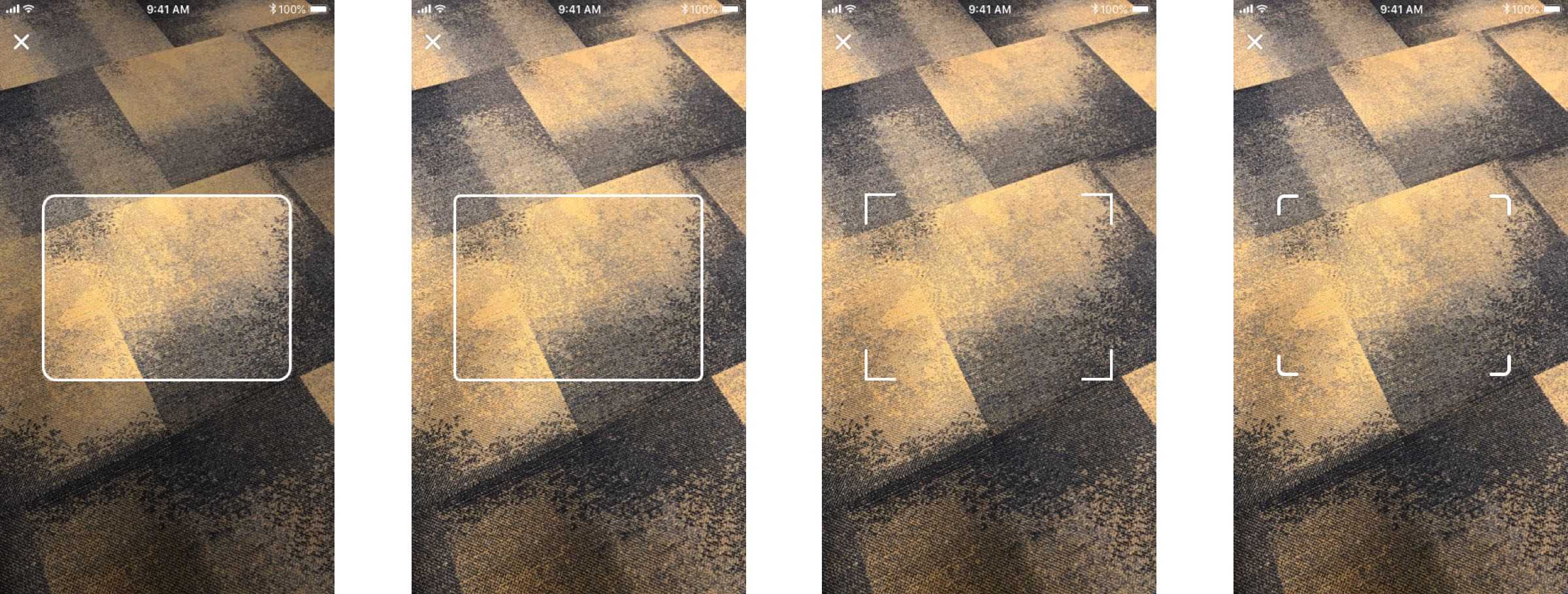
Once the scope had been better defined, I set about iterating on some of the smaller details of the scanners UI. An area I enjoyed experimenting with was the frame. After deciding that we wanted to keep the UI minimal, I produced a number of options. The designs below represent a few of the iterations.
Better feedback
An important objective of the project was to provide users better feedback around system status. Had the barcode scanned correctly? Was there an error? Was the product found?
One way we looked at addressing this was using sound and haptic feedback. We tested a range of sounds and vibration options for different scenarios, settling on a subtle implementation for successful outcomes.

Prototyping with Origami
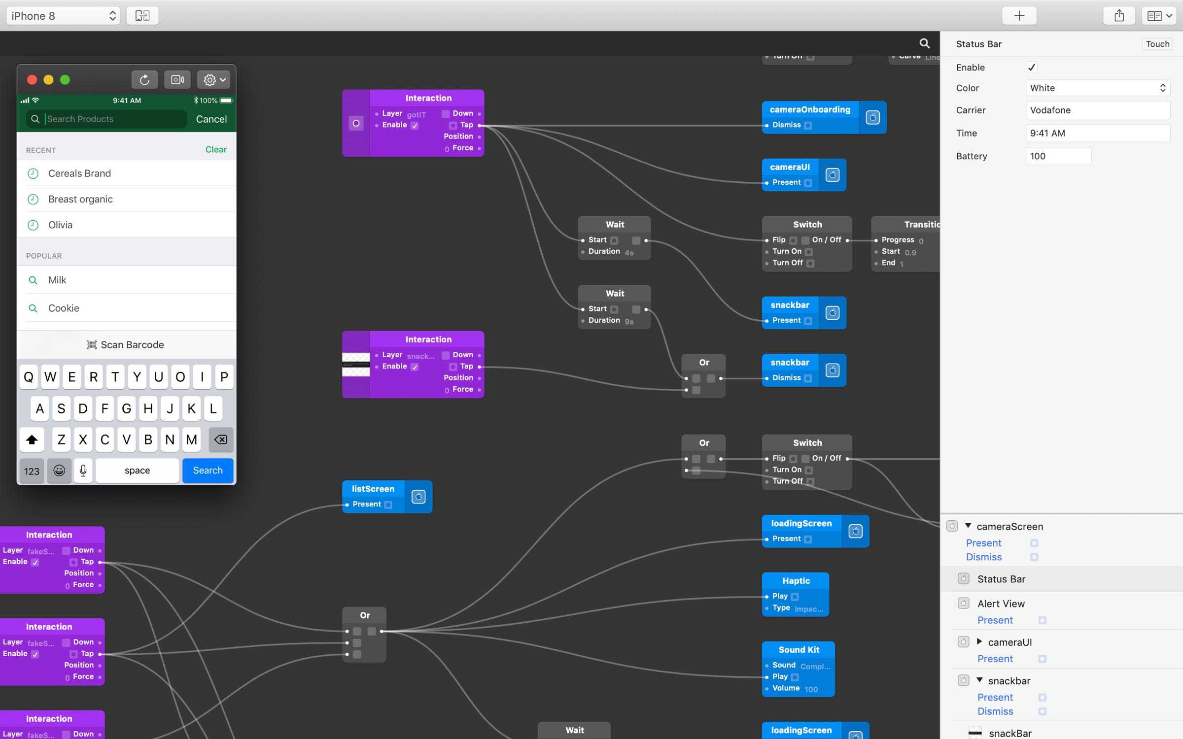
The last step was to produce a rough prototype of what the scanner would look like. Because the camera plays such an important part, I wanted to make sure we had a live camera in the prototype. This allowed us to test with more realistic scenarios, checking the accessibility of messaging and icons in different conditions.
A stumbling block was that Framer does not have native camera support. So instead I turned to Facebook's Origami, learning the basics and building the prototype over a few evenings.
Guerrilla testing
Now we had a testable prototype, I could start to get better feedback. One of the advantages of working on a product like the grocery app is that you are rarely short of test participants.
The first round of testing sessions included some Woolworths employees. With their insight we quickly began to see the potential for the scanner's in-store use. By adapting the API we could allow the scanner to read a range of additional bar codes, simplifying the number of scanning applications Woolworths needs to maintain.
Opportunity
Woolworths processes billions of transactions every week but only a percentage are from online sales. As a mobile team we were always looking for ways to improve the experience of app users shopping in-store.
These new scanner insights helped frame the problem in a different way. Combing the smart phone camera and emerging AR, machine learning and geolocation technologies, how could we build the groceries app of the future? After a number of workshops we narrowed our focus to 4 areas.
Key concepts
- Personalising the in-store experience
- Improving lists
- Aiding in-store navigation
- Supporting better product choices
Proof of concept
Once we had explored some potential ideas, the next task was to see if what could work. I was far too eager to wait until we had allocated development resource, so instead I scoured the internet looking for prototypes that could achieve our goal.
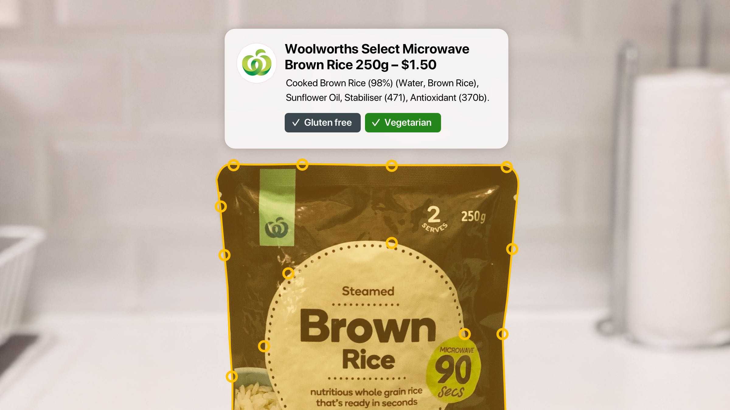
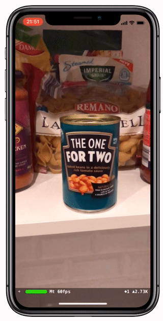
Most of the traditional design tools weren't up to the task, so instead I turned to Xcode. By scanning Woolworth products using an AR mapping app and hacking a simple tutorial I was able to build this demo using an iPhone X and ARKit over the course of a weekend
Augmented in-store experience
After sharing the proof of concept with the team and working to validate the feasibility, the idea of augmenting the in-store experience began to gain traction.
During company hack day, I lead a team in exploring how we could combine a number of concepts into a holistic in-store experience. The designs below were an early explorations in achieving the goals listed above. The final concepts where later presented to Woolworth's senior leadership.
